You’re familiar with reversal chart patterns like head and shoulders, double top, triple top, etc.
But when you attempt to trade these reversal chart patterns, you find yourself caught on the wrong side of the trend over again.
Then you wonder to yourself:
“Wait a minute, what’s going on?”
“Why am I getting stopped out consistently?”
“Aren’t these reversal chart patterns supposed to “predict” the reversal in the market?”
To answer your questions, you must first understand the real meaning behind a reversal chart pattern (and it’s not what you think).
Read on…
3 things you must know about reversal chart patterns that nobody tells you
Here’s the deal:
Every reversal chart pattern has 3 components to it.
If you know what they are, then you can tell when the market is about to make a reversal without memorizing a single chart pattern.
Cool?
Then let’s get started…
#1: Trending and retracement moves
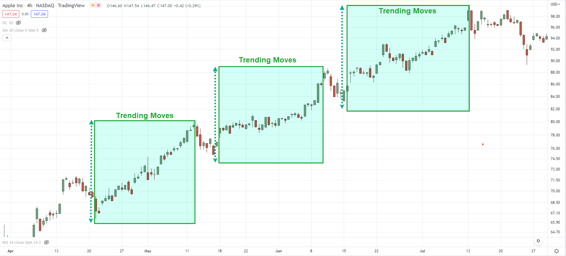
Trending move: The “stronger leg” of an uptrend that moves in the direction of the trend.
Here’s an example:
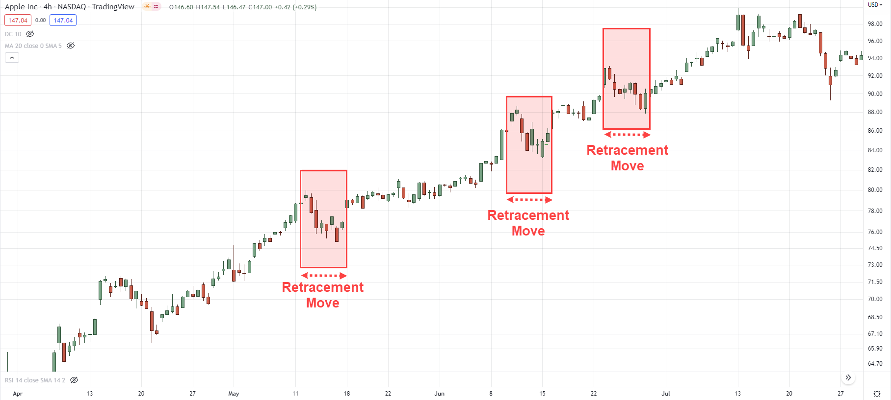
Retracement move: The “weaker leg” of an uptrend, otherwise known as a pullback or retracement.
Here’s an example:
Now you might be wondering:
“Why do I need to know trending and retracement moves?”
That’s because it gives you a clue into the strength & weakness of a market.
For example:
In a healthy trend, you should expect the trending move to consist of bullish candles which are larger than the retracement move.
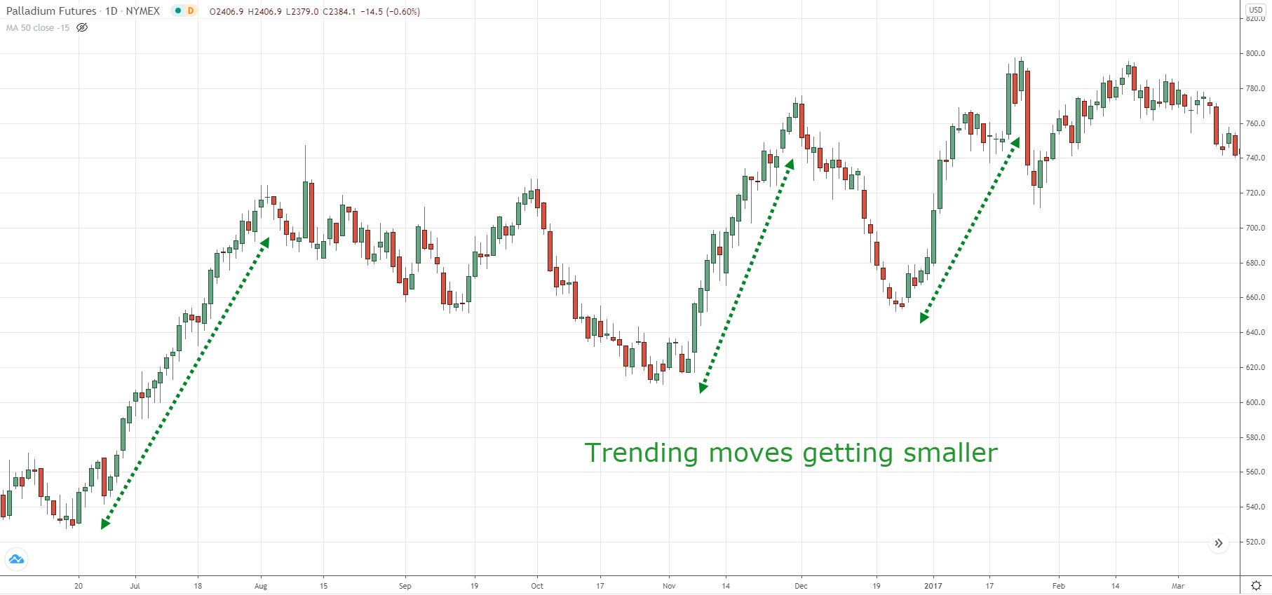
However, if you start seeing the candles of the trending move getting smaller relative to the retracement move, it’s a sign the strength of a trend is getting weak.
Here’s what I mean…
#2: Higher lows and lower highs
This is straightforward.
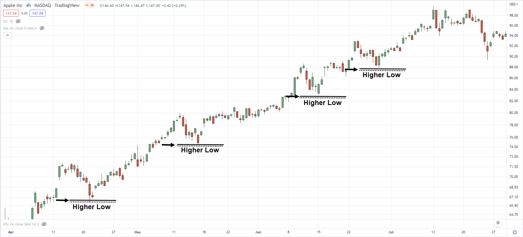
When you see a series of higher lows, it’s a sign of strength as it tells you the buyers are willing to buy at higher prices.
An example:
(Likewise, when you see a series of lower highs, it’s a sign of weakness as it tells you the sellers are willing to sell at lower prices.)
Now just because you see a series of higher lows doesn’t mean it’s a bullish reversal because it could just be a pullback.
That’s why we are looking at multiple factors when it comes to reversal chart patterns which bring me to my next point…
#3: Time factor
Here’s the deal:
The more time the market spends forming a reversal chart pattern, the more significant it is.
For example, if you compare a head and shoulders pattern that takes 30 candles to form against another that takes 100 candles to form.
Which is more significant?
Of course, it’s the one with a longer duration.
Why?
Two reasons.
#1: It’s more obvious and attracts attention from more traders.
#2: More resting orders are placed around the neckline of the head and shoulder patterns (from bullish traders who expect support to hold or, short traders looking to sell the breakdown).
Whatever the case is, the longer a chart pattern takes to form, the more significant it is.
Next…
Let’s use these 3 components you’ve just learned and apply it to some of the common reversal chart patterns so you can see how it works.
Reversal chart pattern #1: Head and shoulders
Quick recap:
To analyze any reversal chart patterns, we want to look at 3 things…
- Trending and retracement move
- Higher lows and lower highs
- Time factor
Now, let’s analyze the head and shoulders pattern with these components in mind.
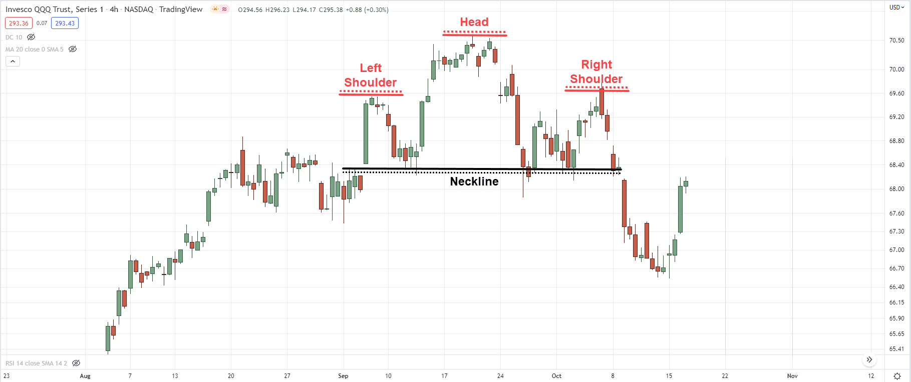
For starters, the head and shoulders is a bearish reversal chart pattern.
(Note: The opposite of a head and shoulders pattern is the inverse head and shoulders pattern)
Here’s how it looks like…
But what does it really mean?
Let’s analyze it step by step…
Head and shoulders pattern: Trending vs retracement move
First, let’s compare the trending and retracement move
In a healthy trend, a trending move should have larger-bodied candles relative to the retracement move.
If a head and shoulders pattern shows the opposite (the candles of the trending move are smaller than the retracement move), then it’s a warning sign.
Next…
Lower high into support
If you look at the head and shoulders pattern closely, you’ll realize there’s a lower high coming into the neckline (or you can call it support).
This tells you there are selling pressure coming in which prevented the price from breaking out of the previous swing high.
Also, if your right shoulder consists of multiple lower highs, then it’s even more significant as it tells you the sellers are willing to sell at lower prices—which is a sign of weakness.
And finally…
Time factor
The longer the head and shoulders pattern take to form, the more significant it’ll be as more resting orders are placed below the neckline.
Here’s why…
Bullish traders will have their stop loss (which is a sell stop order) placed below the neckline so they can cut their loss if the price goes against them.
Bearish traders will have sell stop orders placed below the neckline so they can catch the breakout if the price breaks down.
As more time goes by, more resting orders accumulate which leads to a stronger breakdown.
Reversal chart pattern #2: Descending triangle
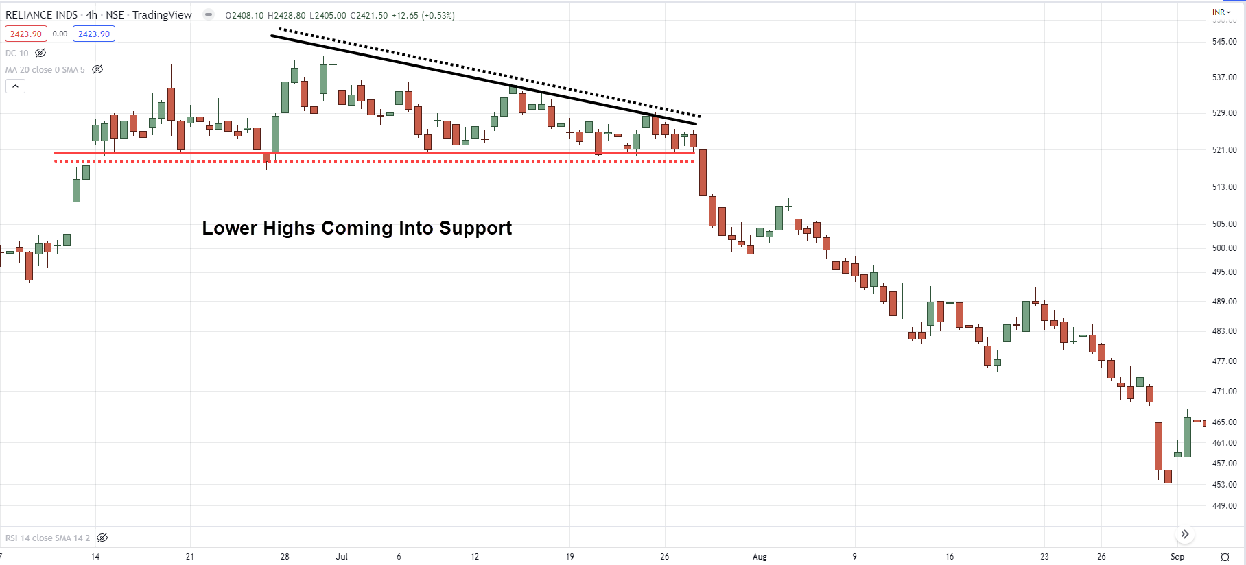
The descending triangle is a bearish chart pattern that shows up as a series of lower highs into support.
(Note: The inverse of the descending triangle is the ascending triangle)
Here’s how it looks like…
Now, let’s analyze it step by step…
Descending triangle chart pattern: Trending vs retracement move
If the market is in an uptrend, you’ll notice the candles within the trending move getting smaller—which is a sign the buyers are getting “tired”.
As for the retracement move, the size of the candles can be big or small initially.
But as it gets closer to the apex (meaning near the end of the triangle), the candles get smaller signalling the market is about to make a move.
Descending triangle chart pattern: Lower highs into support
The hallmark of a descending triangle is a series of lower highs into support.
This is a sign of weakness as it tells you the buyers are unable to push the price above the previous swing high.
Also, the sellers are stepping in as they are willing to sell at lower prices—which forms a series of lower highs.
Descending triangle chart pattern: Time factor
Just like our earlier example, the more time it takes to form the ascending triangle, the more significant it is. And that’s because of resting orders in the market (as explained earlier).
Also as time passes, the descending triangle would get into a “tight squeeze” which usually signals the market is about to make a big move (usually towards the downside).
Reversal chart pattern #3: Double top
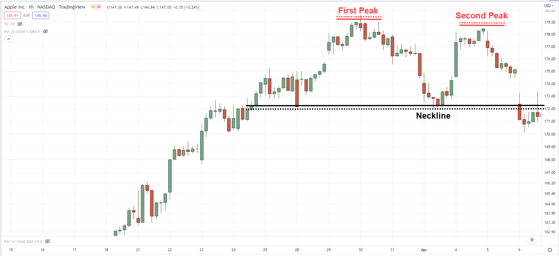
The double top is a bearish reversal chart pattern that looks like an “M” pattern.
(Note: The inverse of a double top is a double bottom)
Here’s how it looks like…
Let’s study it closely…
Double top chart pattern: Trending vs retracement move
Unlike the earlier reversal chart patterns, the double top doesn’t have anything significant when it comes to trending and retracement move.
I’ve seen double top chart patterns with:
- Strong trending moves and strong retracement moves
- Weak trending moves and weak retracement moves
- Weak trending moves and strong retracement moves
So, let’s not get concerned with it because it’s nothing concrete here.
Double top chart pattern: A false break at the highs
The hallmark of a double top is when the price re-tests the previous high—only to get rejected and close lower (otherwise known as a false break).
This tells you there’s selling pressure lurking around and could push the price lower.
Double top chart pattern: Time factor
Similar to our earlier examples, the more time it takes to form the double top chart pattern, the more significant it is.
At this point:
You’ve learned how the 3 components (1. trending and retracement move 2. higher lows and lower highs 3. time factor) helps you to understand reversal chart patterns.
Moving on…
How to trade reversal chart patterns like a pro
At this point:
You’ve learned how to read reversal chart patterns like a pro.
So now the question is, how do you trade them?
Here’s what to look for:
- The reversal chart pattern consists of 80 candles (the more the merrier)
- There’s a buildup formed before resistance (the tighter the better)
- Go long when the price breaks out of resistance
(Vice versa for short setups)
Let’s look at a few examples…
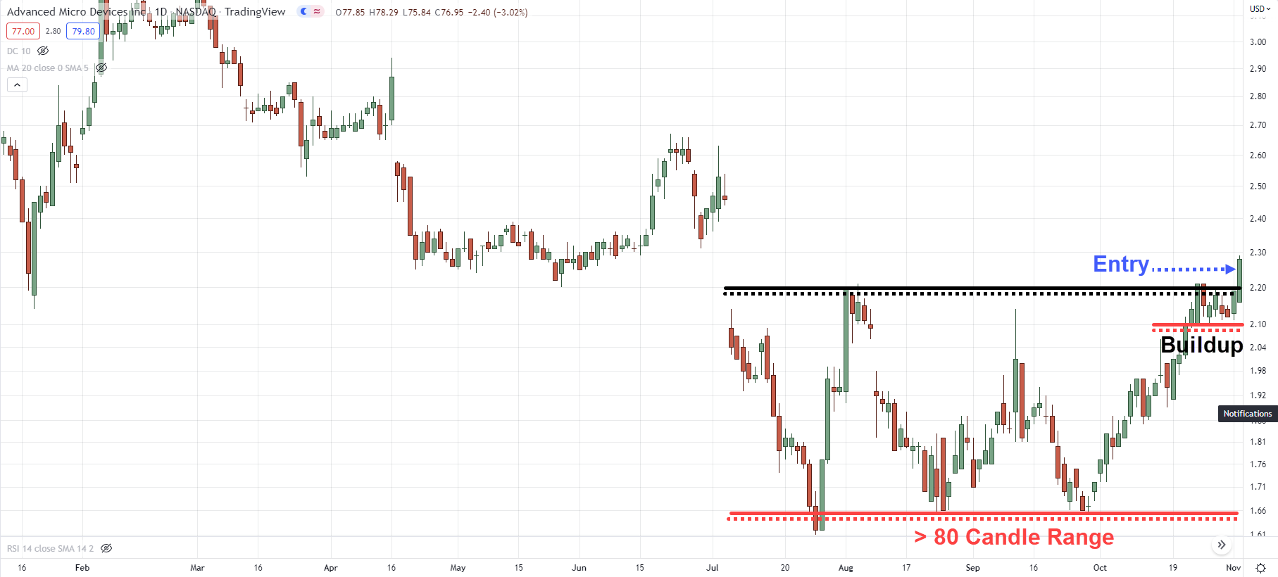
AMD Daily:
AMD formed an inverse head and shoulders pattern back in July 2015.
(Yes, the right shoulder is higher than usual, still, we can classify it as an inverse head and shoulders pattern.)
If you calculate the number of candles, this head and shoulders pattern has 85 candles before the breakout—which meets our criteria.
Next, there’s a buildup (or consolidation) formed at resistance which allows you to set your stop loss below the low of the buildup.
Finally, you can go long when the price breaks above resistance.
Here’s another example…
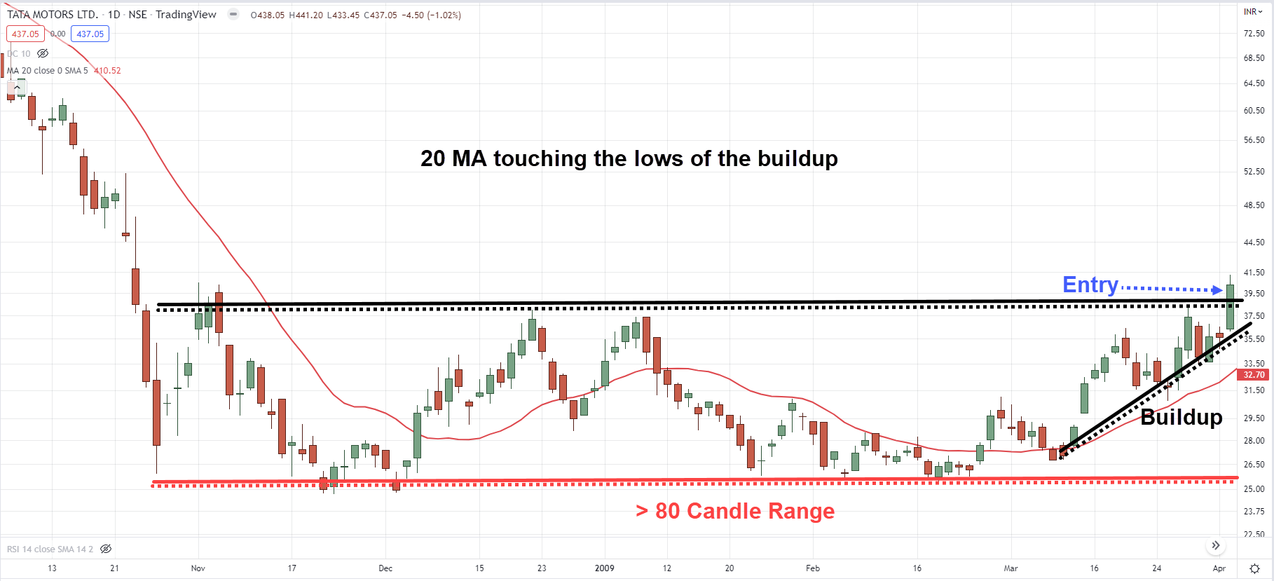
TATA MOTORS Daily:
TATA MOTORS formed an ascending triangle pattern back in March 2009 (with a series of higher lows into resistance).
It took about 124 candles to form this chart pattern which meets our criteria.
Next, there’s a tight buildup formed at resistance which allows you to set your stop loss below the previous swing low.
When all our criteria is met, you can go long when the price breaks above resistance.
Now you might be wondering:
“What if there’s no buildup, do I still take the trade?”
I would avoid taking such trades because there’s no logical place to set my stop loss.
Also, without a buildup, the price could easily swing in the opposite direction which results in a false breakout.
Pro Tip:
I’d like to see the 20-period Moving Average “catch up” with the buildup. This signals to me the market is ready to make a move.
How to trade trend continuation chart patterns like a pro
Here’s the deal:
Reversal chart patterns can also be traded as continuation chart patterns—the context is what matters.
So, here’s how it works…
- A bullish reversal chart pattern is formed in an uptrend
- The chart pattern has at least 40 candles
- Go long when the price breaks above the swing high
(Vice versa for short setups)
As you can see, a key difference between a reversal and trend continuation trade is the number of candles the chart pattern takes to form.
For trend continuation trades, if the chart pattern has at least 40 candles, I’ll be willing to take the trade.
That’s because I’m trading in the direction of the trend which puts the odds in my favour.
Let’s look at a few examples…
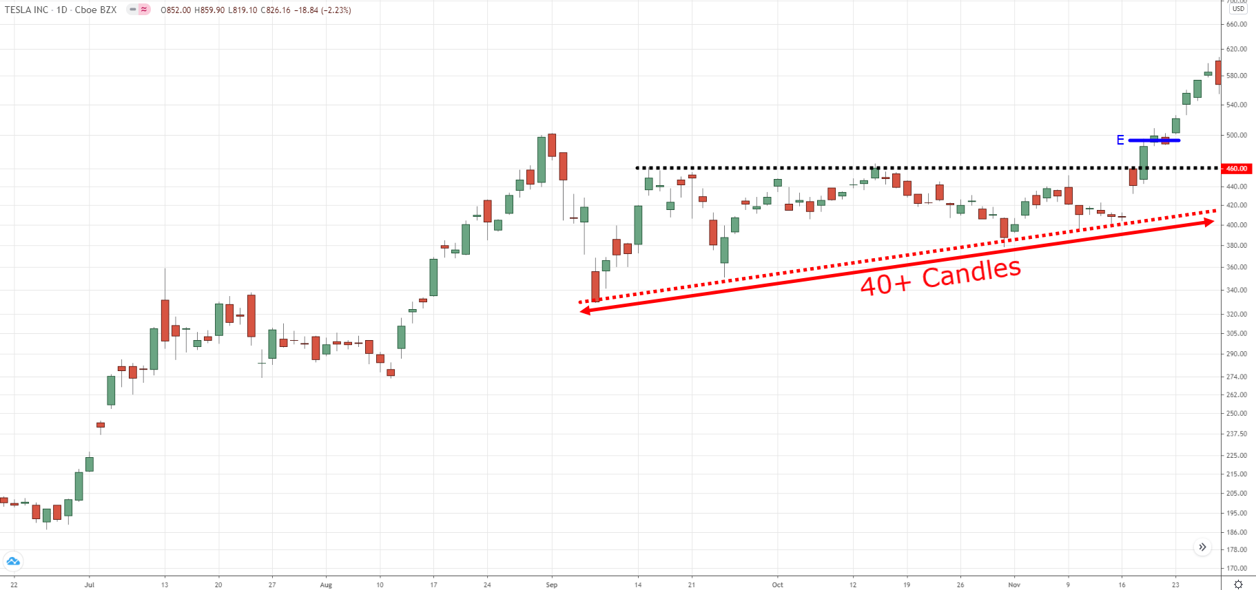
TSLA Daily:
TSLA is forming a potential ascending triangle in an uptrend.
It took 40 candles to form this chart pattern which meets our criteria.
So, you can go long when the price breaks above the ascending triangle.
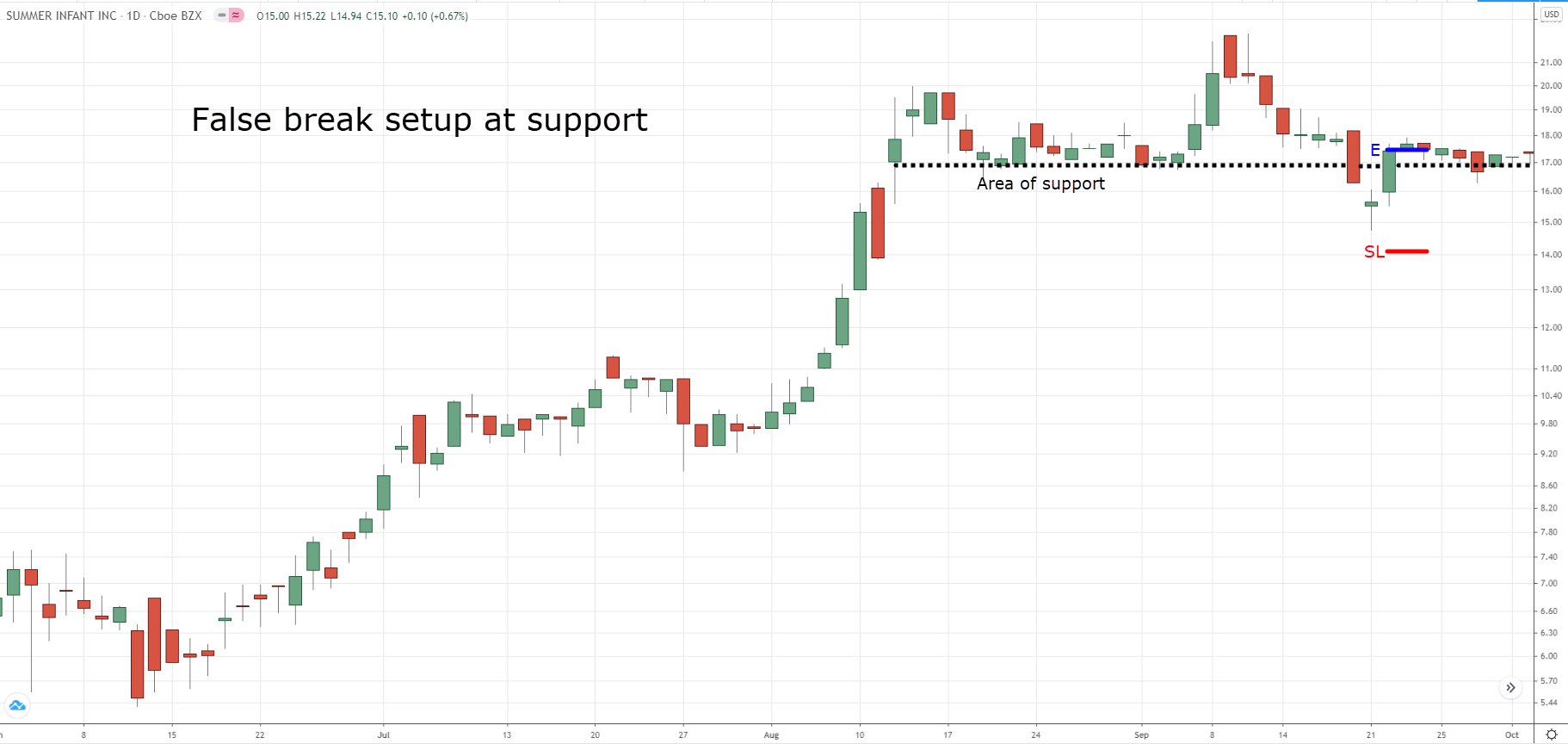
SUMR Daily:
SUMR did a false break when it re-tests the previous swing low and closed bullishly higher (similar to a double bottom).
You can go long on the next open with stop loss 1 ATR below the swing low.
Pro Tip:
When you buy stocks, you want to focus on buying the strongest ones—those that increased the most in price over the 6 – 12 months.
Why?
Because based on research and backtesting, these are the ones likely to outperform the market over the next 6 – 12 months.
Conclusion
So here’s what you’ve learned:
- Every reversal chart pattern has 3 components to it: 1) trending vs retracement move 2) lower highs and higher lows 3) time factor
- Some common reversal chart patterns are the inverse head and shoulders, ascending triangle, and double bottom
- Reversal chart patterns can also be trend continuation patterns—the context is what matters
- To trade a reversal, you want the chart pattern to have at least 80 candles and a buildup before the breakout level
- To trade a trend continuation, you want the chart pattern to have at least 40 candles and forming in the direction of the trend
Now here’s what I’d like to know…
How do you trade reversal chart patterns?
Leave a comment below and share your thoughts with me.

